Monday, May 22, 2006

DIÁRIO DO REALIZADOR / DIRECTOR'S LOG IX

Com a data do concurso a aproximar-se, tínhamos de tomar decisões rapidamente. E após uma conversa de café decidimos alterar algumas histórias. Deixámos cair a história da assassina profissional e da escritora sem ideias e substituímo-las por uma que envolve dois coleccionadores rivais de banda desenhada e pela história de dois boxeurs rivais até depois de mortos.
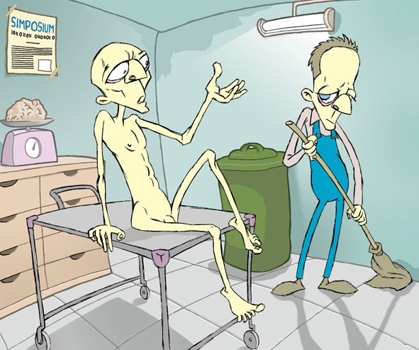
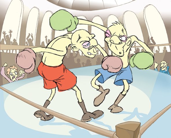
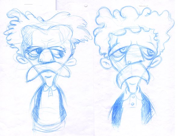
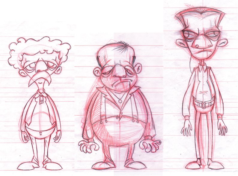
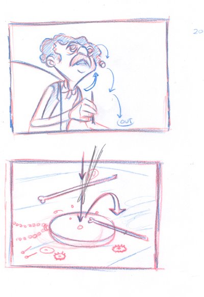
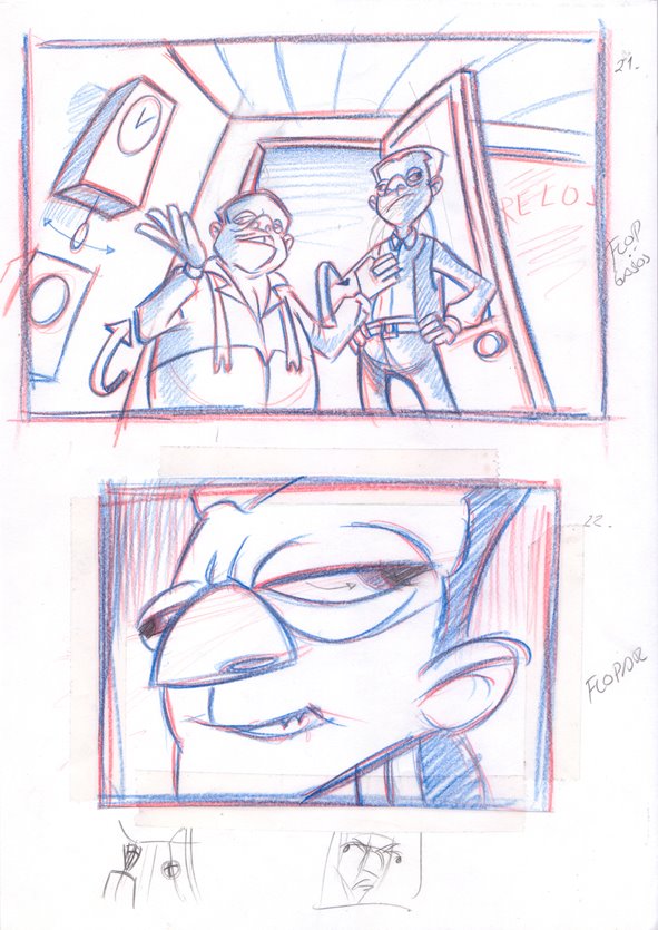
Mas também tínhamos de apresentar o storyboard de um episódio. Resolvemos pedir a ajuda da nossa colega Ana Freitas, excelente artista de storyboards e de banda desenhada, que prontamente se disponibilizou. E a sua ajuda foi fundamental.


The deadline was approaching, and we had to come to some quick decisions. After a brief coffee table chat we dismissed two of the stories that stroke us as the weakest and replaced them by two stronger stories...
But there was another problem. We still needed the storyboard of one of the episodes. We felt like being on a strait jacket. We were just running out of time.
So we turned to one of our colleagues, searching for help. And the winner was Ana Freitas, a very gifted storyboard and comic artist. Fortunately she accepted. And her help was crucial...

Wednesday, May 10, 2006

DIÁRIO DO REALIZADOR / DIRECTOR'S LOG VIII

Agora era importante ver como as personagens interagiam com os cenários. Por vezes o facto de individualmente resultarem, não implica que resultem num bom conjunto….
E foi o que aconteceu…
As linhas grossas ganhavam muito protagonismo, relativamente às personagens. Tornavam o cenário pesado e a quase inexistência de nuances nas cores davam um ar de vectorial. Também o facto da linhas serem a negro não ajudava. Tentámos ainda usar outra cor mais clara para os contornos, mas o resultado não foi satisfatório.
Assim optámos por outra abordagem nos cenários. Contornos mais finos, usos de nuances, texturas, sombras e luzes…
E, claramente, todo o conjunto melhorou…


The next step was to check if both characters and backgrounds worked well together: sometimes the fact that different things work well on their own doesn’t mean they match.
And that was the case.
The thick black outlines were too heavy and conspicuous, pointing out the backgrounds instead of the characters.
Even worse, the entire look was too vectorial. We tried different colours, but still the result wasn’t as good as could be expected.
Therefore, we tried a different approach. Thinner outlines or no outlines at all, textures, and an accurate use of light and shadows definitely improved the all set….

Thursday, May 04, 2006

DIÁRIO DO REALIZADOR / DIRECTOR'S LOG VII

Entretanto, o Nuno já tinha o guião do primeiro episódio.
Agora faltava-nos as personagens. Os dois agiotas e o relojoeiro.
Os dois malandros funcionariam bem por contraste: alto/baixo e magro/gordo.

By that time Nuno had already given me the script of the first episode.
Now we had to deal with the design of both racketeers as well as the watch store owner’s.
The thugs would work on opposite looks: tall/short and thin/fat.


O relojoeiro teria o aspecto típico de vítima; olhar assustado, ombros estreitos…e outros lugar-comuns…

The store owner would look like the typical victim. Scared looking eyes, narrow shoulders…and other usual stereotypes...