E foi o que aconteceu…
As linhas grossas ganhavam muito protagonismo, relativamente às personagens. Tornavam o cenário pesado e a quase inexistência de nuances nas cores davam um ar de vectorial. Também o facto da linhas serem a negro não ajudava. Tentámos ainda usar outra cor mais clara para os contornos, mas o resultado não foi satisfatório.
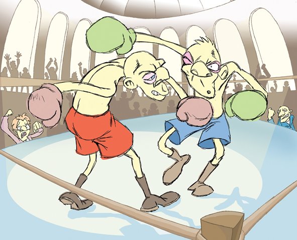
Assim optámos por outra abordagem nos cenários. Contornos mais finos, usos de nuances, texturas, sombras e luzes…
E, claramente, todo o conjunto melhorou…
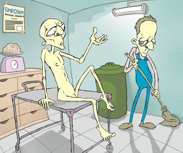


The next step was to check if both characters and backgrounds worked well together: sometimes the fact that different things work well on their own doesn’t mean they match.
And that was the case.
The thick black outlines were too heavy and conspicuous, pointing out the backgrounds instead of the characters.
Even worse, the entire look was too vectorial. We tried different colours, but still the result wasn’t as good as could be expected.
Therefore, we tried a different approach. Thinner outlines or no outlines at all, textures, and an accurate use of light and shadows definitely improved the all set….
No comments:
Post a Comment